“Watch your tone, young man!” (“…. dadburned whippersnapper!”)
This is usually offered generously as a scolding but is not bad photography advise. The tone of our photos will impact the feelings the viewer has when looking at them.
Tone has multiple meanings from the emotional content to the color or general contrast of the image. The simplest meaning, contrast, is something we can often control and improve after the photo is taken and can impact the color tone and even the emotional tone.
What is tonal range?
A pixel can range from pure black to pure white. Before digital photography came along, Ansel Adams measured this range based on how much emulsion built up on a negative. If there was no emulsion (meaning not enough light hit the negative to cause a reaction) the negative was clear and would result in a totally black area on a print. He dubbed this Zone 0.
If the emulsion built up to a point where the negative was opaque (too much light hit the negative) then these areas would result in a pure white area on a print. This is Zone 10.
He always strove to create images that covered the full range from deep blacks to bright whites. This is called tonal range.
In digital photography the scale has more detail. It is essentially the same range, from dark to light, but is broken down into 255 units instead of 10. This scale is represented by the histogram.
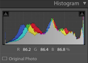
A histogram that shows just the range of brightness/darkness is called the luminosity histogram (the gray part shown in the image above). This is what is most often shown on the back of a camera and can clue you in to whether your photo is too bright, too dark or if it has a nice range.
If the histogram is bunched up to the left, the photo is predominantly dark and maybe underexposed. If it is bunched up to the right it is predominantly bright and maybe over exposed. Being too bunched up anywhere along the scale indicate low tonal range, everything falling within about the same brightness. This is common when we photograph on cloudy days and is often less interesting to look at but might be just right for certain subjects, such as a portrait.
A photo with high tonal range will have a histogram with peaks and valleys spread out rather than bunched up and will result in a more contrasty photo. Contrasty photos tend to interest the eye more causing it to jump around a bit between bright and dark areas.
You may or may not be able to control the tonal range of a scene but it’s always help to be aware of it and understand how the histogram informs you how the camera recorded it.